
I originally wrote this post back in 2012 but decided to update a couple of…
So what is “Responsive Web Design” (RWD) ?
Not that long ago, one of the biggest challenges to the web industry was browser compatibility. Most of the mainstream browsers (except Internet Explorer) pretty much adhered to the industry standards so web designs displayed very similarly generally (e.g. in Chrome, Firefox, Safari) but for a few features, they rendered web pages slightly different.
This caused no end of problems and difficulties (and extra work) to designers to add more code to the design to overcome these problems so that designs looked pretty much the same whichever browser was being used.
Nowadays, browsers are much more standards compliant (including Internet Explorer), so this is not so much of an issue and is far more manageable.
These days, the web industry and everything associated with it is evolving rapidly and changes appear to be growing exponentially. One of the big challenges currently (2013) is supporting the myriad of mobile platforms (e.g. mobile phones and tablets).
There is a massive growth in number of mobile devices available on the market and sales of tablets has rocketed and is predicted to continue as you can see in the diagram below.
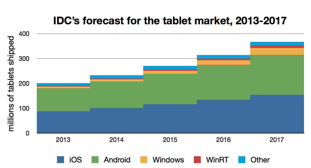
Tablet OS share, forecast from IDC
This growth means that there an increasing number of different screen sizes that web designers have to accommodate in their designs across the range: mobile phones -> tablets -> netbooks -> laptops -> desktops (many screen sizes) -> smart TV’s (some with very large screens). New screen sizes across this range of products seem to be being added on a fairly regular basis.
The issue is, a website these days ideally has to be designed to work on all of these platforms.
The initial approach in the industry to mobile was to develop separate solutions for each device but as the number of different manufacturers and models of mobile phones and tablets increased, the industry quickly realised that this was not sustainable, affordable or maintainable (each separate version of the website had to be updated each time something on the website was changed or added) .
It should be stated however that there is no single solution that works for all situations and there are still (and probably always will be) some instances where a mobile specific application is better suited.
The mobile issue is also compounded by having several different operating systems (e.g. iOS, Android, Windows etc) and a number of different mobile versions of popular browsers running on them. A mobile version of a browser may well behave quite differently to the desktop version.
Today’s approach to mobile is still evolving but it is moving towards using a technique that has been named “Responsive Web Design” (RWD). Another term sometimes used is Adaptive Web Design.
The concept is to have one common design, that runs in any browser, on any platform, which intelligently adapts itself to the device that it is being viewed on. A simple and very effective concept which is proving to be very popular.
The RWD concept originated in 2010 when Ethan Marcotte wrote an article for the popular industry blog, alistapart.com ( http://alistapart.com/article/responsive-web-design) and it has been steadily gathering momentum since.
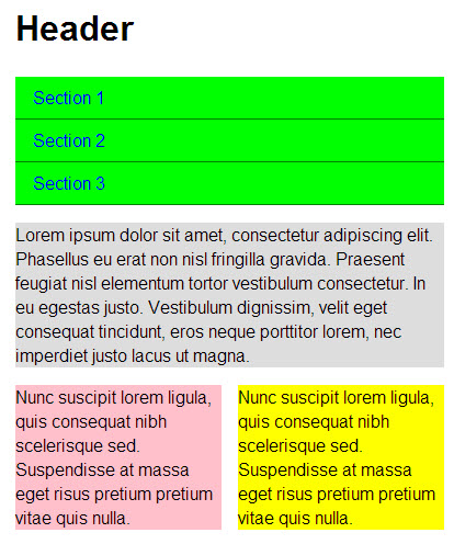
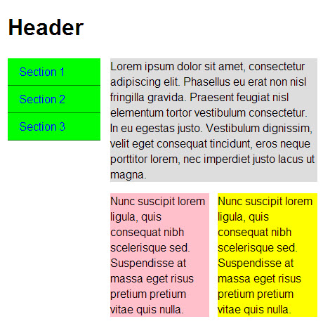
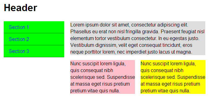
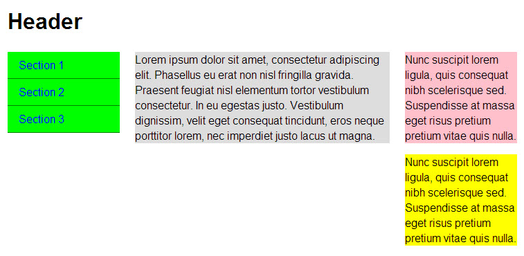
The basic concept is probably best illustrated with a simple example. We start with a small mobile screen version first (this has become the recommended starting point for design).
The initial design shows a single column layout for a small mobile phone size screen with a header, some navigation buttons (green), a main content area (grey) and two smaller areas with additional content (pink and yellow).
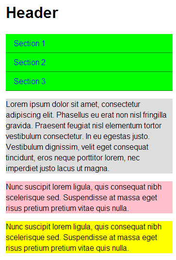
The following images show the effects on the layout as the screen size increases. The coloured “boxes” re-size automatically and as they reach certain breakpoints (screen widths), the physical layout changes (i.e. the boxes change position to adapt to the screen size).
The screenshots have deliberately been included below each other to allow direct comparison as the width increases.

The above article hopefully will give you a basic understanding of what RWD is and what it involves. In reality, it is a bit more complex. For example, images need to re-size dynamically on larger screens, they need to be higher definition for some devices but for mobile phones they need to have small file sizes otherwise they take too long to download and eat up bandwidth so in some cases different images may need to be substituted. All of this obviously adds to the complexity and work involved.
Designing for RWD also requires a re-think in the design process. As mentioned above, the recommended approach now is to design for mobile first and then make it adapt to larger screens.
These are potential topics for future articles.
Related Posts