
Do you use the default email settings in your WordPress website hosted by IONOS ?…

Is your website mobile friendly ? If not you may need to act quickly.
Changes announced by Google could mean that from 21st April 2015 the ranking of your website in the mobile search results could drop significantly if your website does not meet Google’s “mobile friendly” criteria. Obviously this could be a big issue if your competitors are compliant and you are not.
The importance of mobile
There has been major growth in the use of “mobile” devices for accessing the Internet and it is predicted to continue to grow.
For some time now, the UK has been leading the rest of Europe in Mobile and Tablet use. Mobile now accounts for 44.8% of ad impressions, 50% of clicks, 46% of spend and 43% of conversions in the UK according to recent statistics released by Marin Software in Q1 of 2015.
So, what are mobile devices? This is sometimes a bit confusing, clearly we have mobile phones but tablets are also mobile and you could argue that so is a laptop.
Most survey data at present seem to consider a laptop as a PC (i.e. same as a desktop PC). “Mobile” therefore groups the smaller screen size devices, although some data lumps mobile phones and tablets together, some treat them separately.
The constantly increasingly range of mobile devices available today has resulted in changing patterns of use of the Internet because they enable access to the Internet “on the go”. This means that people can access the Internet for longer periods during the course of the day than they used to and they are using a mixture of different devices to achieve this.
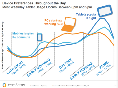
The following image from Comscore research results published in 2013 illustrates this very clearly.
UK Office of National Statistics (ONS) data gathered in 2014 supports this fact and shows that almost 7 out of every 10 adults are using a mobile phone, portable computer and/or handheld device to access the Internet ‘on the go’.
With this change in the market, it is obviously very important these days that your website can accommodate all the different platforms people are using otherwise you could be missing out on visitors to your website.
Although it is a fairly new concept, the web industry is already tending to move towards what is called using “Responsive” web design (RWD) as the recommended solution to make a website mobile friendly. This has also been echoed by Google who recommend it as the preferred solution.
“Responsive” means that the design dynamically adapts the layout of the page being displayed to suit the size of screen on the device that is being used.
If you are building a new website then it is essential that you make it responsive. If your current website is not responsive then you need to decide on what to do. Retro fitting responsive functionality to an existing website design, particularly if it is a few years old, may not be so simple and it is generally far simpler and cost effective to start again from scratch with a new design.
“Appearing on smartphones is critical for local businesses. 94% of smartphone users look for local information on their phone and 84% take action as a result, such as making a purchase or contacting the business.” Google
People are also increasingly using their mobile phones as the main method of accessing their Social Media accounts (e.g. Twitter, Facebook, LinkedIn) these days. If you have posted an update on your Social Media channel and included a link to your website (making use of Social Media as a marketing channel to drive traffic to your website), they are most likely to click through immediately to your website from their mobile phone to find out more. If your website is not mobile friendly and hence the content is difficult to read they may not bother and go somewhere else instead that is.
Testing for “mobile friendly”
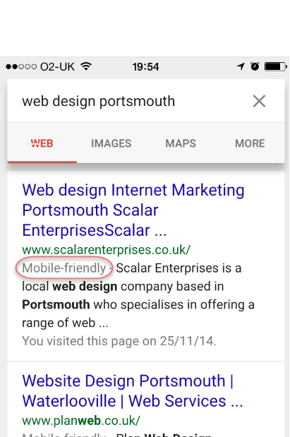
So is your website mobile friendly ? The first thing to do is to carry out a search on your mobile phone for something on your website and look at the results. If your website meets Google’s criteria, they will include a tag which says “Mobile-friendly” before the description in the search results as highlighted in the image below. Note that currently, this tag will not appear on search results on a tablet, laptop or desktop PC. Some in the industry are predicting that Google may lump mobile and tablet together in the future.
(UPDATE: Google tweeted on 1st April that “The upcoming mobile-friendly change is for mobile users, not tablet users.”)
A page is eligible for the Google “mobile-friendly” tag if it meets the following criteria as detected by the “Googlebot”:
- Avoids software that is not common on mobile devices, like Flash technology.
- Uses text that is readable without zooming.
- Sizes content to the screen so users don’t have to scroll horizontally or zoom.
- Places links far enough apart so that the correct one can be easily tapped on a small screen.
Google warning
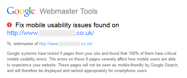
In January 2015, Google started sending emails to webmasters informing them when they had detected that their website was not “mobile friendly” and that this would have an effect on ranking positions in mobile searches. An example of this is shown in the image below:
So what to do ?
Before you start panicking, the first thing to do is find out how important mobile is to you and your business. For some businesses, it might not be a big problem.
Firstly check your analytics data and see how much traffic visits your website from mobile devices. The example analytics data below shows the split of site visits from all platforms, mobile and tablet:
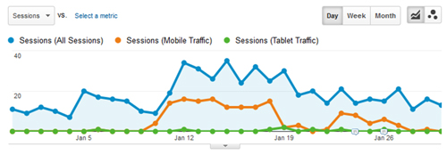
In this particular case, at its peak around 50% of the traffic was coming from mobile so it is significant and clearly should not be ignored. If the mobile traffic was much lower then perhaps the issue is not so urgent.
Bottom line is that you should not ignore the issue, it is very much a case of when, not if your website needs to be made responsive. Probably best to have a talk with your web designer and discuss how best to proceed.
Related Posts